Tag: painting

  • Watercolor Paintings

    Watercolor Paintings

    Milky Way At Night
    Milky Way At Night

    You may have noticed a number of new watercolor paintings lately. Why all of a sudden have I moved to a new medium? Partly, it’s from the portability. Last summer I picked up a great little travel watercolor kit from Windsor Newton’s Cotman line. The kit fit nicely into my travel bag and I brought it with me regularly to the Doll House Baked Goods’ Farmers Markets.

    I started painting some of my #spaceshipaday drawings while hanging out at the markets. One of the images was used for the cover of my Coloring Book, Coloring Space 1. I liked the simplicity and speed. And the Windsor Newton Cotman Watercolors were a lot better than I expected.


    I have to credit James Gurney’s blog with a great series on Plein Air Painting techniques. He’s got� great tips on making your own portable art setup. Definitely worth the time to go through if you have any interest in Plein Air Painting – plus he has great dinosaur paintings.

    Once I got the hang of the basics, as with any paint media, I started trying out a few other subjects including some of my favorite lighthouses and scenes. Not only is watercolor a fast media to use, it’s quite unforgiving. That forces you to commit to your painting faster than usual. It’s a good exercise and with the right touch they can look fantastic.

    I am by no means a master at this, and I don’t claim to be. This is merely another chance for me to explore color in my artwork. As much as I enjoy the digital experience with my iPad, Procreate, and a stylus, there’s something more visceral and rewarding about working with traditional tools.

    Artist Travel Kit

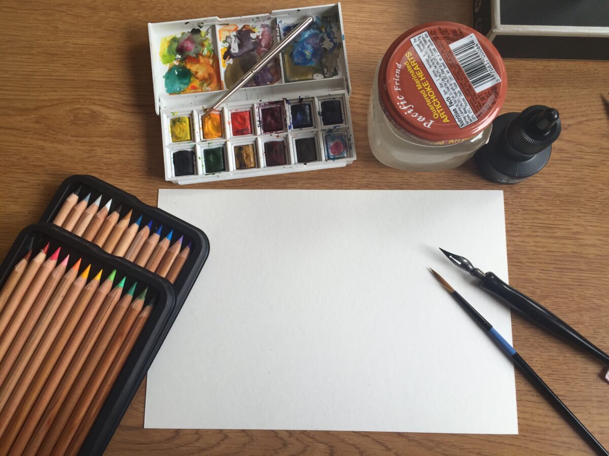
    These sketches were fun but I was finding that I wanted a few more options during some of the longer market sessions. Then we packed for a long RV trip to Michigan and I wanted to bring some of my paint supplies with me.� I was limited to a few pens, pencils and smaller 4″ x 6″ cut sheets of watercolor paper – my basic drawing package that I bring with me almost everywhere. But back home I had a lot more tools and supplies that I often used in my studio. To get things a bit more portable I started gathering my essentials into a larger kit.

    Wine Box To The Rescue
    Wine Box To The Rescue

    I started with a fine wooden box from Chateau Ste. Michelle, a perfect size for my kit. It would be a bit larger than a sling-bag but it gave me a few more options while on location.

    Now I have a bigger container of pens, including my ink-well style pens from ages ago when I drew my cartoons by hand. They still work very well. I also have a small Prismacolor Colored Pencil set, a new box of Pentel watercolors that I’m just starting to try out, my old design pastels, Golden liquid acrylic paints, a jar for water, erasers, and several pencil sharpeners. It all fits nicely in the box and it even leaves enough room for a wider variety of watercolor paper sizes.

    Sure it’s a bit more to carry than my sling bag, but it also acts as its own tabletop when I don’t have a lot of flat surfaces. Later I’ll figure out an option for mounting a tripod and maybe re-work the lid into a drawing table with optional angles, who knows. The existing hinges are more decorative and won’t hold up well� with repeated heavy usage.

    I’m looking forward to doing a lot more of these, especially once we open our new shop. There I’ll have the room to work on paintings in the public full-time.

    Now Available In My Store

    A number of these are already available for sale in my store. I’m offering the originals right now and will be offering prints once I decide on a proper avenue for producing them. As much as I hate to turn this into a giant sales pitch, the purchases do help me continue making these. Thank you all

    Space Art By Christopher Doll Store
    Space Art By Christopher Doll Store


  • Cape Disappointment Lighthouse Painting

    Cape Disappointment Lighthouse Painting

    Given the amount of space and science fiction work showcased on my site, people may be surprised to see me tackling a terrestrial subject like a lighthouse on a cliff. However, painting from life subjects is an essential method for anyone who wants to learn how to draw and paint, digitally or otherwise. I learned this both on my own, and through many art classes during college. While I majored in Industrial Design, the core program was based on London’s Royal College of Art – a program that focuses heavily on drawing from nature and life.

    Cape Disappointment, located in the Southeastern corner of Washington State, has a lot of history to me and my extended family. We’ve held annual family reunions in the area for over three generations. Some of my earliest memories include trips to the ocean beaches and the lighthouses, so I thought I’d tackle a landscape that held some value to me personally.
    This is a 20″ by 30″ stretched canvas, and I used acrylic paint. Some of the additives I used included a clear gloss medium which helped me build layers of transparent details building to the overall look. I started by blocking in the sky and water.

    CapeDisappointment_Start

    And that’s a shot from my home studio. From there I added the cliffs, clouds, horizon, and later came back and made the churning water. Sadly most of my visits to Cape Disappointment took place during rough weather, even in the summertime. Even under dark skies and rain it’s a beautiful location.

    CapeDisappointment_BlockedInCliffOcean

    Next I added the lighthouse forms and tree line. At this point they weren’t detailed, merely placeholders while I brought the rest of the painting up to a similar level of detail.

    CapeDisappointment_BlockedInLighthouse

    After getting all the elements in place, I focused on the lighthouse itself. My wife and I deliberated on having an explicit light beam coming from the lighthouse, out into the sky. To me it felt forced, so I left it as you’d expect to see it in person – a lonely light against a dark sky.

    CapeDisappointment_LighthouseDetail

    The closer you get to finishing a painting, the longer it takes to get all the details. I spent the last chunk of time working out how the rocks should look, water splashing against the shore, and refining the clouds and trees. In the end, I’m happy with the painting, but it still doesn’t feel finished. The curse of the painter, I’m learning.

    CapeDisappointment_Final

    I put it on a wall to take some photos, and my family liked it so� much, it’s stayed there so far.

    CapeDisappointment_OnTheWall

    As an exercise, I like to refer to this as “practicing my clich�s”, referring to a quote by Kevin Costner in the movie Bull Durham. In that movie Costner plays Crash Davis, a veteran baseball player tasked with trying to coach the brash and young Ebby Calvin LaLoosh (played by Tim Robbins) into becoming a big-time pitcher. Here is Crash Davis’ sage advice regarding interviews:

    Crash Davis: You’re gonna have to learn your clich�s. You’re gonna have to study them, you’re gonna have to know them. They’re your friends. Write this down: “We gotta play it one day at a time.”
    Ebby Calvin LaLoosh: Got to play… it’s pretty boring.
    Crash Davis: ‘Course it’s boring, that’s the point. Write it down.

    Some may find a lighthouse on a cliff is a bit of an artistic clich�, especially when you consider Art spelled with a capital “A”. But they make me feel good, they’re fun to paint, and people enjoy them. To me, this was a fun exercise. Enjoy!

  • Painting Wonder Woman at The Drunken Easel

    Painting Wonder Woman at The Drunken Easel

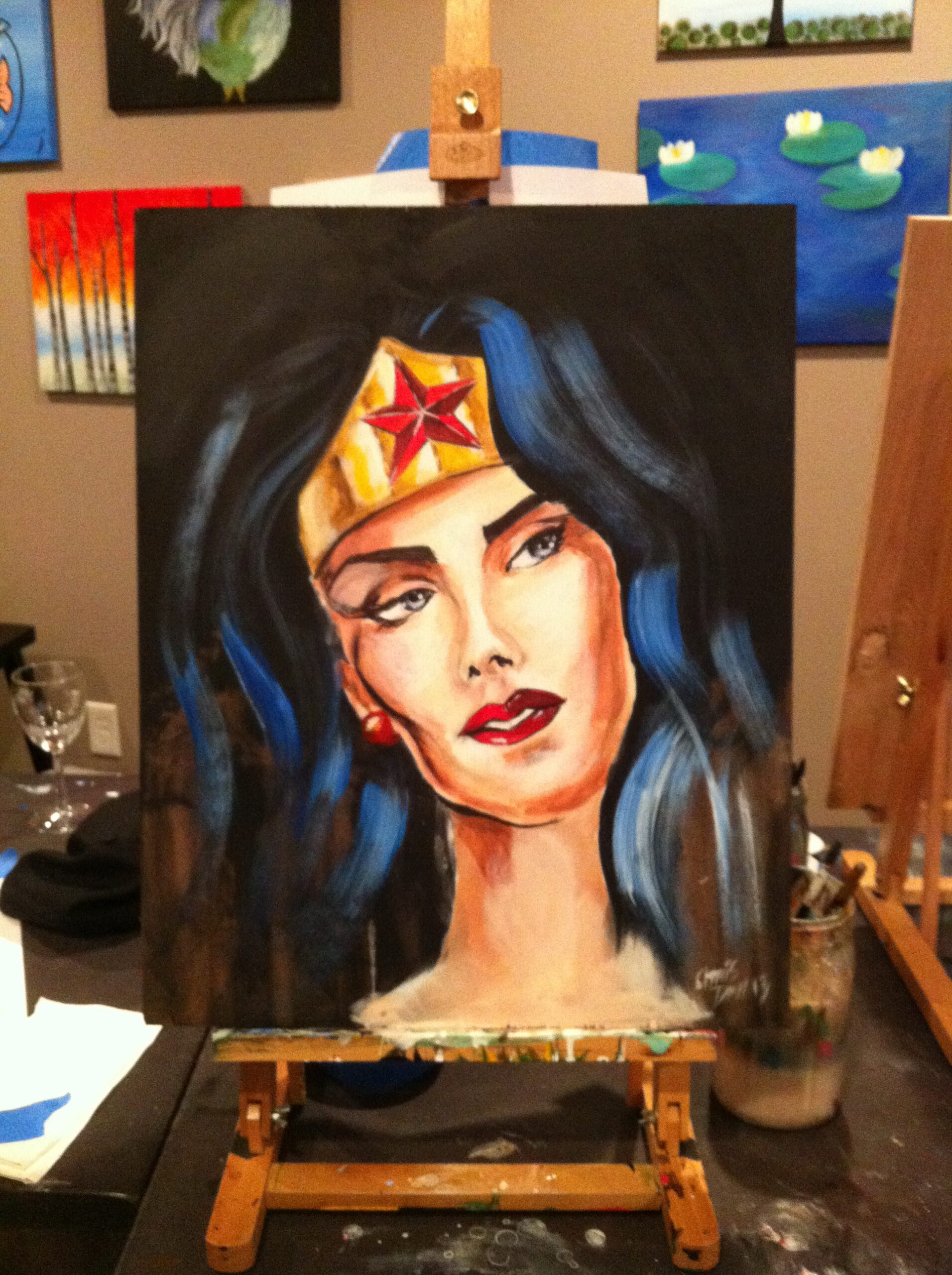
    My new friends Justin and Janell hosted guest artist Son Duong for an afternoon session at The Drunken Easel in Woodinville, Washington. Son’s art has been used by companies like Skull Candy, and he has a love of comic book heroes like Wonder Woman. For me, this was a great chance to paint a human form – something that I’ve been practicing, but haven’t yet gained confidence to the level where I’m happy sharing any samples.

    Photo Jan 12, 11 58 15 AM

    The class included several Drunken Easel regulars, of all ages, and I was happy to see it wasn’t only comic aficionados.

    Photo Jan 12, 1 22 11 PM

    Son provided a a graphic to use as guidance, which helped in a four hour session, and walked us through the steps as we dripped paint onto the plywood boards we were using as a canvas.

    Photo Jan 12, 1 22 22 PM

    I’ll admit, I struggled, and it wasn’t clear to me why I was having difficulties getting the color tones to work the way I wanted them to. In principle, shading and forms work similarly to the kinds of illustration I’ve been doing with hardware and space scenes. By merely adding the human element, I got tense. We’re born knowing human faces visually, at least those who have sight, and as a result we’re all highly aware of faces that are off by just the smallest bit. Whether it’s the proportions on the eyes, expressions, even the fall of hair on the shape of the head. When any of these aren’t working, it’s easy to spot.

    Photo Jan 12, 1 22 03 PM

    Eventually, with the help of several quality stouts, I loosened up and pushed through the final stages. Overall I’m happier with the end piece than I was halfway through it, and it’s not something I’d be inclined to hide in the garage anytime soon. I consider it a success in that I tackled a subject, and a style, that is outside of my comfort zone.

    Photo Jan 12, 4 44 11 PM

    Son did an amazing job on the sample (shown below), which is up for a raffle on The Drunken Easel’s site. If you’d like a chance to own this yourself, check it out.

    Photo Jan 12, 4 45 28 PM